Wednesday, 28 February 2018

WELCOME MODERATOR

ALEXANDRA MACLEOD
1472
CLAREMONT FAN COURT SCHOOL 64680

Welcome to my blog

I worked with Megan Sedgwick 1473, Francesca Tarpey 1476, Josephine Dean 1470

Brief 2: I made a promotional package to include a trailer, together with the film magazine cover, featuring the film and poster for the film.

Our trailer is immediately below, my individual FILM MAGAZINE COVER and individual POSTER are above.


All my RESEARCH and PLANNING follow below that on the main blog roll, in reverse order, starting with the latest first. To present my research and planning, I have used a wide variety of platforms and tools, including Slideshare, Emaze and Blogger.

My evaluation is above under four Pages. Clicking on each tab will show the research and planning that went into my responses to these questions. 
To present my responses I have used the following platforms:
Question 1: Video annotation
Question 2: Prezi
Question 3: Piktochart
Question 4: Slideshare

I took charge of the filming for the opening shot of the French kitchen, the blood dripping on the white sheet, our protagonist running in and out of the rooms, the close up of the egg cracking, the  high angle shot of the protagonist looking into the CCTV camera and the final scene of people watching the game show in their living room.
As a group, we edited the trailer, put together the inter titles and scripted the voice over.  

Here is our trailer 'Pain Perdu'.

PLANNING: WRITING THE VOICE OVER

My group decided that it would be a good idea to include a voice over at the start of the trailer to give the audience the needed information about the film and to also set the scene.

Our script:
It was my first time in France
And the first time I spent with my Aunty
She wasnt how my mum had described her
Things started to get messed up
My Aunty was messed up
And I had no one to turn to, but everyone was watching me.

This voice over will also add more context to the trailer. It is Molly, our protagonist speaking about how she is feeling and the information she had been given about her Aunty before she left. This will make it easier to for the audience understand what the film is about.

Thursday, 18 January 2018

CONSTRUCTION: GREEN SCREEN

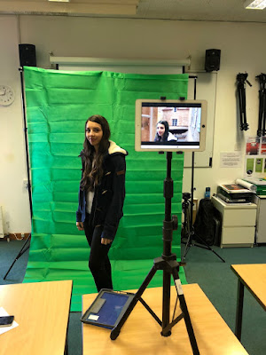
Today, I was taught how to incorporate different technologies, such as a green screen into our filming. We set the green screen up using two tripods and a black frame from which we hung the green screen from.

We used an iPad to film through the app Green Screen by Do Ink. We put the background as the window in which Molly, our protagonist, will be looking out of. Anything green in the shot (the green screen) will be cut out and replaced with our chosen background. The app allows us to put up to three layers to create an even more realistic view of the setting we wanted to create. The video will be saved at 1080p or 720p from the iPad.


Tuesday, 12 December 2017

PLANNING: FILM POSTER

I went looking for posters with a similar theme to my film in the hope that I could get some inspiration for when it came down to making my film poster.
I particularly like the film posters from Girl, Interrupted and Shutter Island as I love the expressions and shadowing on the faces.

The Horseman - hands over eyes

Wednesday, 6 December 2017

PLANNING: OUR INTERTITLES

Here are the inter titles we have chosen to include in our trailer. We decided to have a black background with white simple font so that there were no other distractions to create more of an impact. As well as this, the last three inter titles are the words TWISTED TRAPPED TERRIFIED which are three very powerful words that also present alliteration.


Tuesday, 5 December 2017

CONSTRUCTION: SCRIPT YOUR INTERTITLES

I used the BBFC website to study the inter titles in three trailers that I picked.

BRAVE


The first inter title to appear says 'From the creators of Finding Nemo, Up and Wall.e which were all very successful and popular films. The reference to these films will increase the attraction of the film Brave because they are already easily recognised by existing audiences, Brave will inherit audiences. As well as this, these brands had specific easily recognisable font designs.

The font design for Brave gives the audience an idea for the theme of the film, suggesting it is to do with action and adventure as it is bold, seirf and in capital letters. This is also very eye catching and more likely to leave a greater impact. More importantly, the design evokes the interwoven Celtic patterns engraved on warriors swords and the 3D, metallic quality hints at a whole era of chivalry.

The inter titles are placed very strategically in the trailer, in between key moments so that the audience is more likely to remember it. Although there is no voice over in the trailer, the inter titles are written in the format of a sentence so it serves the same purpose a voice over would.

GRAVITY


The inter titles used in this film are very short and powerful. This leaves an impression with the audience for longer.

There is no voice over in this trailer: I believe that a voice over would not have given the film the right feeling as it would not have conveyed the sense of isolation in space and almost make a mockery of the film.

The first two inter titles have the first line appearing half a second before they add the second line. This gives a sense of curiosity and leaves the audience hooked. The next three inter titles juxtapose the first two. This is because it starts off with amazing aerial images of the earth looking very peaceful and beautiful when then suddenly something goes wrong and the inter titles of DON'T LET GO appear rapidly one after the other to indicate danger.

The inter titles are also not just placed against a black background but are on top of the action in the film. This shows that the film is chaotic and dangerous. The inter titles in this trailer also provide extra information. The second to last inter titles says 'From Director Alfonso CuarĂ³n' which will leave the audience hooked and also acts as another attraction to the film. 

Thursday, 23 November 2017

COLLAGE FOR PLANNING

Ideas for the interior of the house
Ideas for the exterior of the house